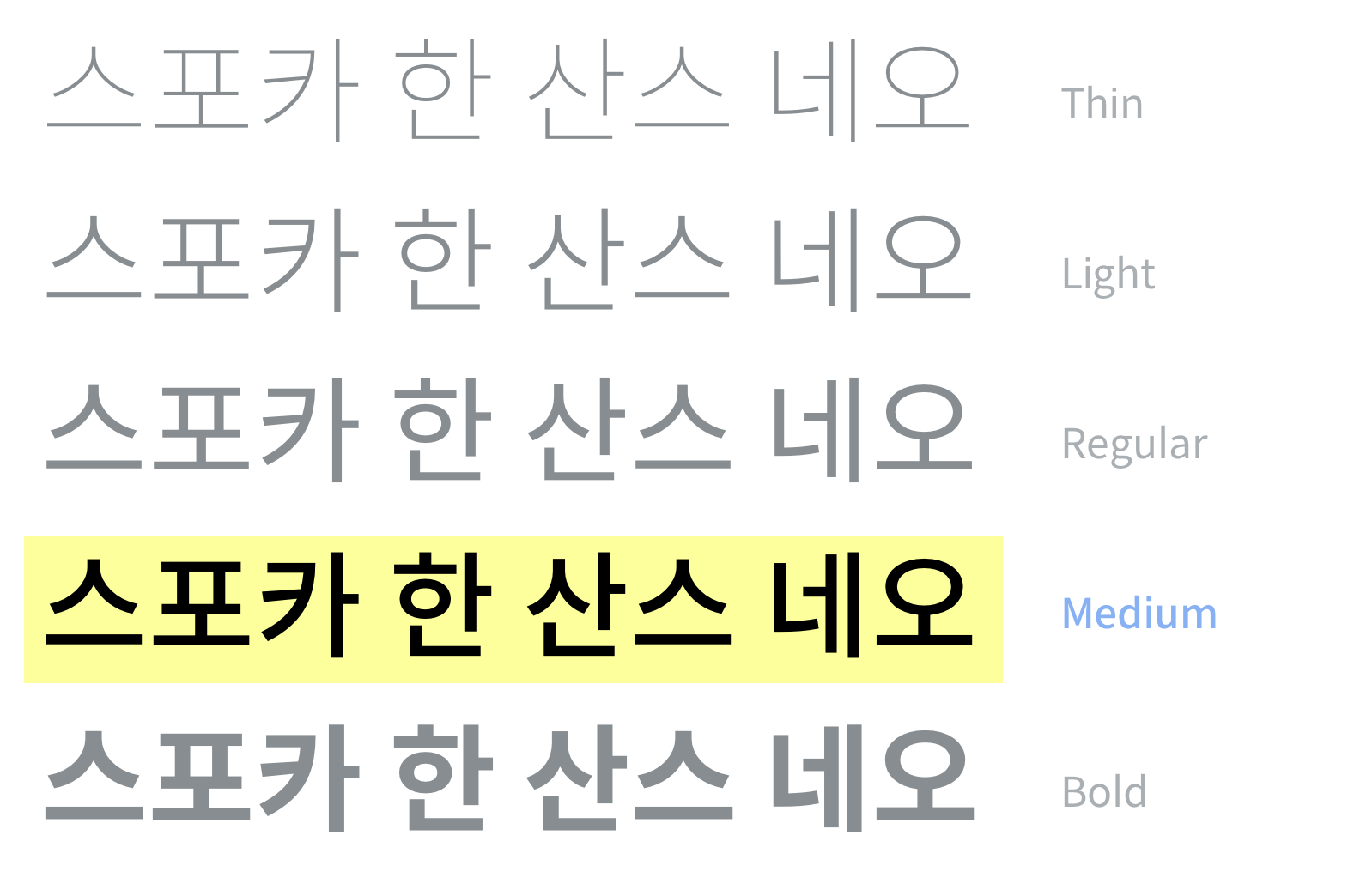
Spoqa Han Sans Neo is a font that improves the previous Spoqa Han Sans. It supports more diverse weights and improves the readability and uniformity. 스포카 한 산스 네오는 기존의 스포카 한 산스를 개선한 글꼴입니다. 더 다양한 웨이트를 지원하고, 가독성과 통일성을 향상했습니다. スポカハンサンスネオは従来のスポカハンサンスを改善したフォントです。


Spoqa Han Sans Neo
Custom font released in 2015

We maximized usability in
various language environments.
Spoqa Han Sans Neo aims to support both Korean and Japanese service harmoniously. Therefore, we customized Noto sans which is an open source font which supports both Korean, English and Japanese texts.
We customized numeric figures for
Spoqa’s service.
Dodo Point is a membership service based on mobile phone numbers. We customized numeric figures for higher usability. We refined rounded strokes of Lato to accordingly match Noto Sans Korean.
We optimized font file size for
websites.
Noto might not be the best choice on a website, due to its heavy size. We have cut off the number of characters from 11,172 to 2,350. Spoqa Han Sans Neo now reduced its size down to 441KB, which was 16MB in the initial version.
Now we release the latest version, Spoqa Han Sans Neo.
We thank everyone for being a big fan of Spoqa Hans Sans. We received helpful feedbacks and comments. As developers of Spoqa Han Sans, we discoverd more to elaborate in our product. Now we release the new Spoqa Han Sans Neo. Let’s take a look around.
*We would like to thank designer Wi Ye-jin for her advice on typography.

We unveil evolved Spoqa Han Sans Neo


There were both angular and round glyphs in the previous Spoqa Sans which gave heterogeneous feelings. We angled the shapes of the other round glyphs in Spoqa Hans Neo, to match the number glyphs of the Lato font. The legibility and uniformity of the font were improved through this modification. EM size glyphs were also modified to make the same impression when writing text in multiple languages, including Japanese.

We adjusted the length of the bounding box to the normal size. We Found and deleted glyphs that are rarely used but abnormally long. Now, you can use Spoqa Han Sans Neo without any extra adjustment in the Adobe program and Android studio.

We added Medium weight, a font style between ‘Regular’ and ‘Bold’. While the thickness difference between Regular and Bold is large, the lack of weights in the middle limited the design. The use of fonts has become wider and more beautiful typography is possible by adding Medium weight.

Carets are often used along with “learn more” or “back” labels. We added caret glyphs to PUA (Private Use Areas). Therefore, Spoqa Han Sans Neo provides caret with higher consistency among text labels, and also cuts off time to work on a caret icon.

Spoqa Han Sans Neo supports OTF and WOFF2 formats based on Postscript Curve, unlike before when only TTFs were supported. When you use it as a webfont in Windows, the font is printed more clearly and can be used in high-resolution printouts.

We improved usability by adding additional characters to the complete code system of Hangeul. Subset of the latest version Spoqa Han Sans Neo provides a total of 2,574 characters plus 224 additional characters. Learn more from “Proposal for Additional Korean Characters in Complete Code of Hangeul”.

We changed the shape of Guillemet to match other letters. We changed corner brackets and arrow brackets to have halfwidth forms instead of fullwidth. So every user can use it in general-purpose applications and web environments without additional setting.

Try Spoqa Han Sans Neo

Enter Spoqa Han Sans Neo by typing random characters below!
You can select specific font family you want, and change the font size, line height, letter spacing, color.

Download Spoqa Han Sans Neo

Click the download button and try it on your PC now!
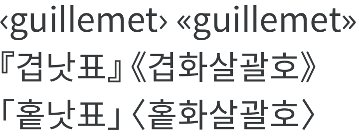
The Korean subsets support a total of 2,574 glyphs. You can use it with more compact capacity than the original version.

Spoqa Han Sans Neo is available for all users, including individuals and businesses,
and can be freely used, modified and redistributed under an open font license.


Using Spoqa Han Sans Neo as web fonts

To embed Spoqa Han Sans Neo into a webpage, there are two ways.

Copy this code into stylesheet as the import method.

@import url(//spoqa.github.io/spoqa-han-sans/css/SpoqaHanSansNeo.css);

Or copy this code into the <head> of your HTML document.

<link href='//spoqa.github.io/spoqa-han-sans/css/SpoqaHanSansNeo.css' rel='stylesheet' type='text/css'>

And then, specify the font with font-family in the <style> tag.

* { font-family: 'Spoqa Han Sans Neo', 'sans-serif'; }

If you use below ways, it may take a while because it is a free serve version. We recommended to serve it directly to your server. If you need more information, refer to “The Tips on Using Spoqa Han Sans Web Fonts (KO)”.


Spoqa Han Sans is everywhere!

Spoqa Han Sans is loved for clear numeric figures, and various web services concerning numbers make use of it.
Because Spoqa Han Sans is distributed free, you can easily find it on web pages of non-profit events or art events. Check out the links below to find out Spoqa Han Sans simply everywhere!